
The average landing page conversion rate is a measly 2.35%, according to data from WordStream. The good news is that the top 25% of brands enjoy a much higher average of 5.31% and the top 10 can expect averages around the 11-12% region.
We’re not here to talk about average conversion rates, though. We’re here to tell you how you can increase conversion rates significantly with a series of simple fixes – 15 of them to be precise. In this article, we’ve got a series of landing page design and optimisation fixes that are quick and easy to implement without using any expensive software.
#1: Remove the navigation menu
According to Instapage, 94% of landing pages have navigation menus, filled with links that users can click on to take them away from your offer. To communicate how counterproductive this is, let’s just link to a VWO study that says removing navigation menus from your landing pages can increase conversions by 100%.
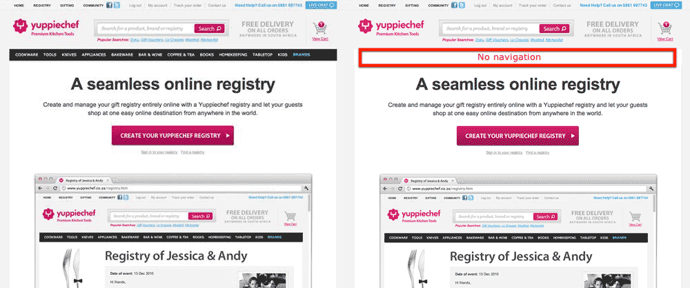
So, if your landing pages have navigation menus in the header or anywhere near the top of the page, get rid of those things. If you really want to provide a path away from your landing pages, put a navigation menu at the bottom of your landing pages, after visitors have seen your message in full.
#2: Reduce loading times
In 2018, Google released data on the impact of mobile loading times on conversion rates and the figures were telling. With every additional second it takes for your pages to load, the risk of bounce drastically increases and many of these visitors will never come back to your site again.

In a separate study, Unbounce found that 81% of marketers understand that loading times influence conversion rates but only 3% of them said faster loading times was a top priority in 2019.
Loading times clearly matter to the end user and marketers simply aren’t;t taking this need seriously enough. So why not get ahead of 97% of your rivals and make faster loading times a priority for this year?
#3: Create more landing pages
Landing pages exist because businesses need a way to deliver targeted messages to prospects. Generic landing pages fail because they don’t pinpoint a specific pain point and provide a solution that excites their target audiences.
According to HubSpot data, businesses that increase their number of landing pages from 10 to 15 see a 55% increase in conversions and leads.
The key is to have a single offer on every landing page and focus on specific issues your target audiences are facing. Every campaign that targets a unique audience or selling point should have its own landing page with this message as its only focus.
#4: Match your Ad and landing page headlines
Once you know you’ve got enough landing pages, the first thing you should check is that the headline for each page matches the headline in your ad. The message in your ad is what convinced users to click in the first place and you have to deliver on the promise you made.
So match those headlines to instantly communicate that users are about to get what they want.
This doesn’t only apply to headlines, either. The entire message on your landing page should act as an extension of the promise made in your ad. This concept is known as message matching and it’s crucial for landing page conversion rates.
#5: Use dynamic content to match headlines with user intent
Unfortunately, matching headlines with ad copy is getting more difficult with features like dynamic keywords insertion in Google Ads – not to mention the fact that keyword matching types are increasingly liberal these days.

If you happen to be using Unbounce as a landing page builder, the company has an excellent solution called Dynamic Text Replacement. This feature automatically matches the headline of your landing pages to the exact query users type into search engines.
You still need to make sure the message on your landing page is highly focused on the offer in your ad but Dynamic Text Replacement can ensure your headlines always match.
#6: Test your headlines
Whether you’re using a tool like Dynamic Text Replacement or not, headlines are one of the first elements you should be testing on your landing pages. It’s not only the text of your headlines that you want to test but also the font, size, contrast, positioning and overall design of your headlines that need to instantly capture user attention.

You might want to experiment with visual cues to direct user attention, such as in the example above. Or you might want your headline to be the boldest, standout element on the page – two very different but worthwhile design approaches to test.
#7: Test your hero section content
While the headline is arguably the most important element on your page during the first few milliseconds after your page loads, the surrounding content in your hero section quickly comes into focus.
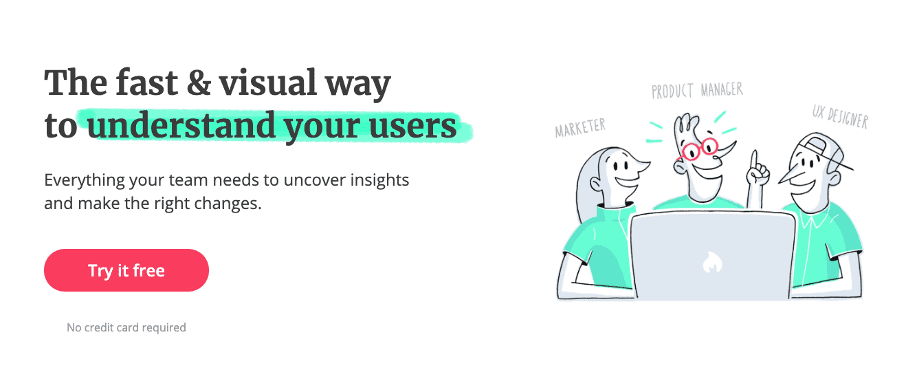
At this point, users will see the content surrounding your headline and everything else within the first field of view, above the fold. So you need to test everything within this field of view and pay special attention to all of the copy in your hero section, including any CTA that you might have.
#8: Test your primary call to action
Speaking of which, regardless of whether you have a CTA in your hero section or not, now is the time to start testing your primary call to action. We say “primary” call to action because we’re specifically talking about the first CTA that users see on your page and, yes, you should have more than one – but more on that in the next section.
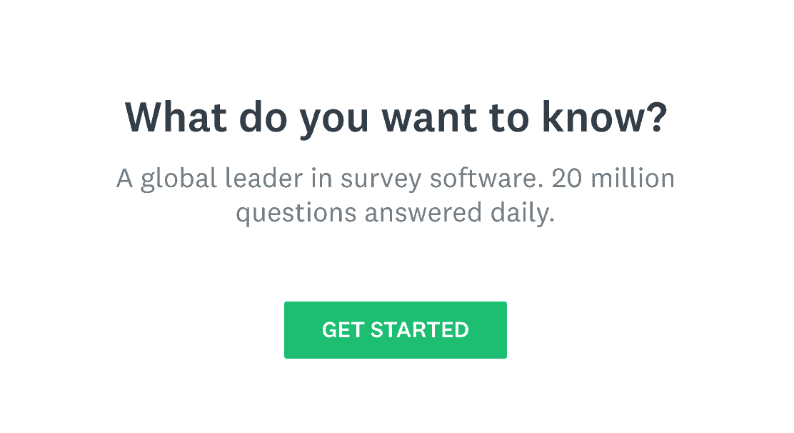
For now, focus on that primary CTA and maximising its impact because this is where you want the vast majority of your conversions to be coming from. Think about placement, visual design, contrast, weighting, font choices and every tool at your disposal to make your CTAs pop out of the screen.
Above all, though, make sure you test the copy in your CTAs because it’s this message that users ultimately buy into – or don’t. It’s amazing how many businesses invest time and money into testing the visual design of their CTAs without properly testing the wording of their copy.
#9: Add secondary calls to action further down the page
A common landing page “best practice” you might often hear is that you should only have one call to action on each page. There’s a problem with this theory, though. Once users scroll past your CTA, you lose the opportunity to make it jump out at them again if you’ve only got one.
On the other hand, if you place multiple CTAs throughout your landing page, you have other opportunities to catch their attention and reword your offer to try and capture the angle that really matters to them.
Now, another common best practice is that you should only have one offer on each landing page and this is a great principle, in theory, because your landing pages absolutely should be focused around a single offer.

However, there’s a small problem with this theory, too. A lot of users simply aren’t going to buy into that offer and you’re going to lose your opportunity if you don’t follow up with a compelling alternative. So it makes sense to have a secondary conversion goal on each landing page – eg: an email signup or a free download – that requires less effort from users than your primary conversion goal.
Place this CTA towards the bottom of your landing pages (test placement) and use it to generate soft leads that you can nurture with email campaigns.
#10: Optimise your forms
Every conversion goal requires users to complete a form of some kind and you don’t want poor form UX to be the reason someone doesn’t buy into your offer. When a user starts filling out one of your forms, this means they’re ready to do business and it hurts when you lose a customer because they failed to complete the form process.
So optimise these things to remove conversion barriers and make it easy for users to complete the action you’ve asked them to take.
#11: Optimise and test your landing page copy
By this point, we’ve looked at the key individual elements of your landing page that matter most – headlines, hero sections and CTAs. Although we also said earlier that the cop in your CTAs is what ultimately convinces visitors to take action and the same principle applies to your entire landing page.
Landing page copy rarely gets the attention it deserves but this defines your entire message.
While you can optimise the visual design and UX of your pages to boost performance, the most decisive aspect of each landing page is the copy that communicates your offer. Either it captures attention and influences buying decisions or it doesn’t.
You need to make sure it does.
Start by removing any jargon and sales talk because nobody’s buying into that. Next, go through your copy and remove every cliche you can find – and they’re in there. Ditch phrases like “leverage,” “unleash,” “cutting edge,” “innovative” and all of that fluff.
https://twitter.com/semrush/status/1234409111858614272
In fact, take a look at the terms used in this tweet above and you find anything like this on your landing pages, get rid.
Now, open up a clean word document and write new copy for each landing page to test, following these steps:
- Stop talking about yourself and your product
- Talk about your audience’s problems
- Show the solution (not yourself)
- Show users how to get the solution
- Keep it conversational
- Edit to get rid of jargon and cliches
Once you’ve got your new copy, walk away and let it breathe for 24 hours and then you can go back to it with a fresh set of eyes to edit once again. Now, you’re ready to test your new copy against the original and you’re going to repeat this process over again to continue improving your landing page copy.
#12: Use stats, figures and numbers where possible
Humans are funny creatures and we instinctively trust stats, figures and numbers as being true facts. We do this without even checking where figures come from or how they were calculated. If we did investigate where these figures typically come from, we’d quickly realise that the sample sizes in 99% of studies are so small they’re basically useless.
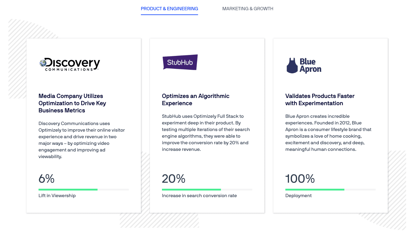
So try to capitalise on this logical fallacy by using stats, figures and numbers where you can on your landing page to illustrate the impact and benefit of your offer.
#13: Run the 5-second test on your landing page
The five second test is a basic conversion optimisation method where you show people a design for five seconds only and then ask them to describe what they say. This is particularly useful for testing landing page designs because you have so much information to convey in a short time.
Usability Hub even has its own online Five Second Test tool that you can use to test your pages.
Keep in mind that you want to run these tests on people similar to your target audiences who will have a certain level of understanding about your offer. For example, if your target audience is small business owners looking for mobile payment software, they already have knowledge and experience about your product and the challenges they face with accepting mobile payments.
These are the kind of people you want to make an impression on within five seconds.
#14: Find out what users are getting up to on your landing page
Testing your landing pages blind is going to get hit-and-miss results but there are tools that can help you find out what users are getting up to on your pages and fix conversion killers. Heatmapping tools are the first thing to look into, which allow you to see which elements users are clicking on, where they move their mouse and even where they scroll.
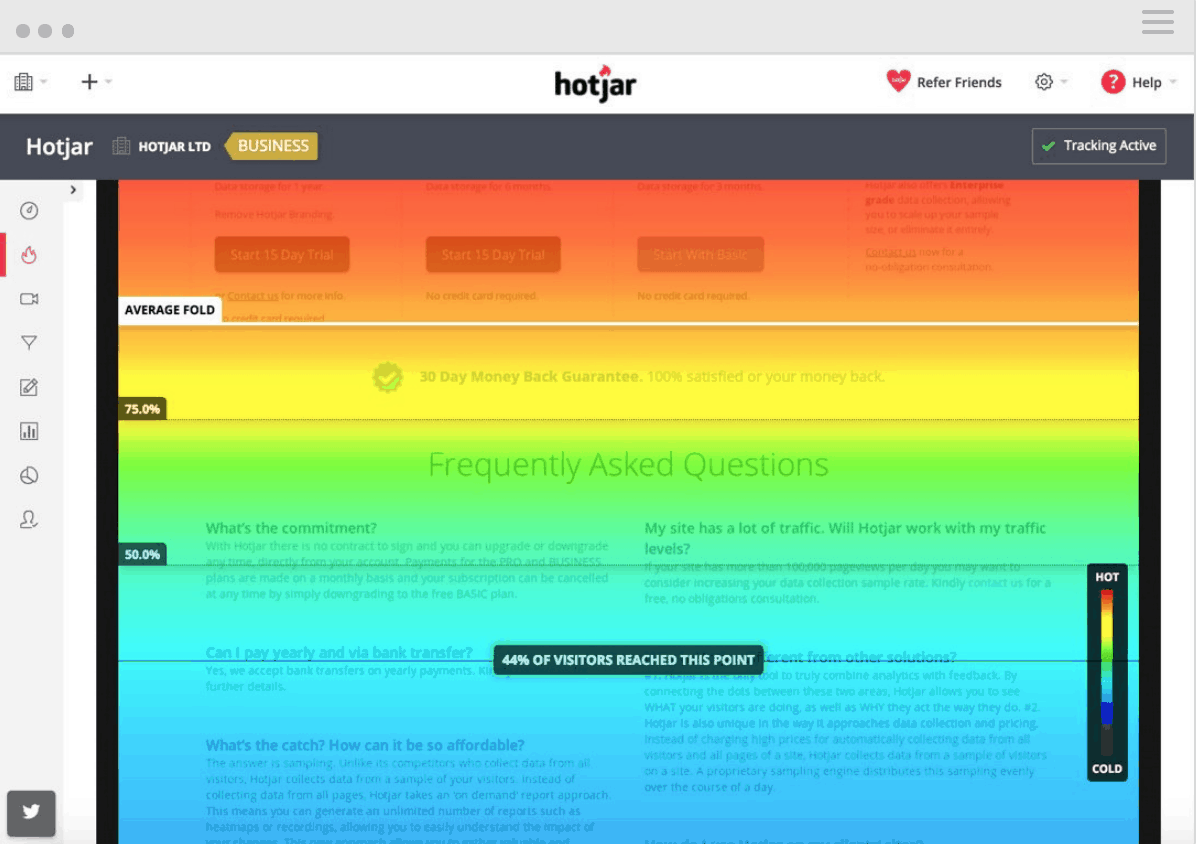
Scroll heatmaps are especially useful for landing pages because you can check that users are seeing your CTAs and enough of your message. This is invaluable for testing CTA placement and new landing page copy.
It will also help you identify potential UX issues that might be preventing users from engaging with your page as you intend.
#15: Up your remarketing game
As we said in the intro of this article, the top 10% of brands can expect an average landing page conversion rate of 11-12% and even if you manage to beat this number, the majority of users who visit your landing pages aren’t going to convert – at least, not the first time around.
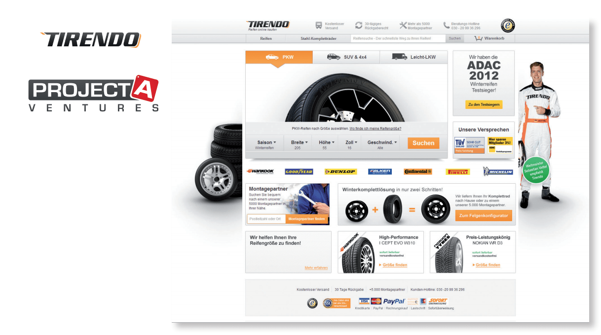
This is precisely what remarketing is designed for, bringing previous visitors back to your website to complete the conversion. Google Data (PDF) shows that online tire retailer Tirendo increased conversion rates by 161% and sales by 22% using remarketing campaigns, to give you an idea of what this strategy is capable of – crucial if you truly want to maximise conversion rates.
The tips we’ve looked at in this article are all quick and easy to implement across your landing pages but there are more comprehensive optimisation measures you can take, too. If you think your pages are underperforming and you want a complete optimisation strategy put in place, you can call our advertising experts 0161 870 2580 or reach out to us on social media.